Architecture by C.Kairouz Architects, build by JBMgroup, photography by Dylan James, interior design by Melissa Vukadin, styling by Kimberley Barker & Barnaby Lane.
We've got to warn you — every photo of 31 Kellett Street will transport you to a state of zen — and we're certainly not complaining.
Interior stylist Kimberly Barker collaborated with a brilliant team on a sustainable, light-filled, modern family home in Northcote. With a mutual love for a rich and tonal palette, it's no surprise that we jumped at the opportunity to be involved in the project.
Today we're talking about creating calm with a minimalist approach to design. We spoke with Kimberly on the vision for the home and how created a home that feels more like a sanctuary.


Tell us a bit about how you got your start into design and styling.
I have grown up with parents that have renovated my whole life which translated to my own projects as an adult. My dad is a painter and has always appreciated architecture and design and my mum has a natural flare when it comes to putting materials and furniture together. Styling and Design is in my blood and is something I absolutely love and thrive on. I love learning from any challenges and feel so satisfied when a space not only looks great, but reflects a little of who I am as a person.
What was the vision for the Kellett St. project?
A sustainable home that is airy, light filled, functional and feels like a sanctuary with a neutral palette for a modern day family that appreciates a sense of calm and the space that they live in.
We are loving all of the natural light in the home. Why was this important and how did you achieve it?
Natural light was a crucial aspect for us that we thoroughly considered when we were working with C.Kairouz Architects on the design of the home. The void and the large floor to ceiling window feature allows natural light to flow through the entire house from top to bottom and is further complemented by well positioned windows throughout the house. I love that not only does natural light increase the aesthetics of a space but it also enhances energy, mood and overall quality of life really making this home a haven to retreat in.
How would you describe the overall feeling of the home?
A functional, minimalistic sanctuary of calm.
How did you go about selecting furniture and materials for the home?
Nature is our greatest inspiration when it comes to materials and furniture selecting and ensuring that a neutral and tonal palette is consistent throughout the home.
What details of a room do you think are most important?
Functionality and ensuring that every room is bright with natural light and feels connected with the rest of the house.
What design elements were important for you to weave into the design of the home, and what trends did you want to stay away from?
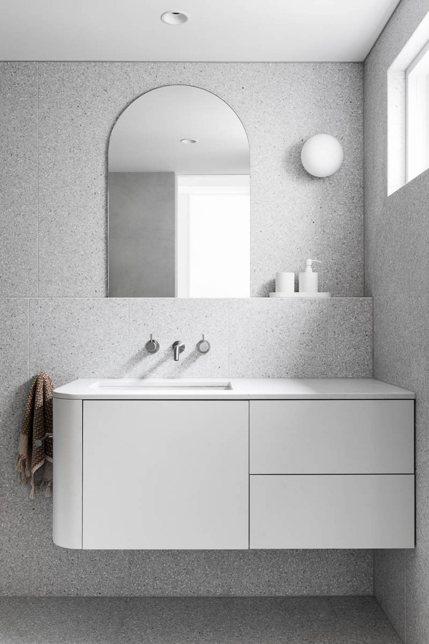
We kept true to ourselves with the mindset that we were designing the home for our own family to live in while ensuring the overall design and feel had longevity. We stuck to natural and neutral elements and stayed right away from anything bold. The subtle curves throughout the home keeps it modern while still holding its integrity.
We are seeing themes of vertical lines and open spaces. What was the goal with these themes?
Repetitive vertical lines were purposely used in the design to create cohesiveness and a sense of calm while the open and airy spaces create easy flow throughout the home and increase natural light opportunities.
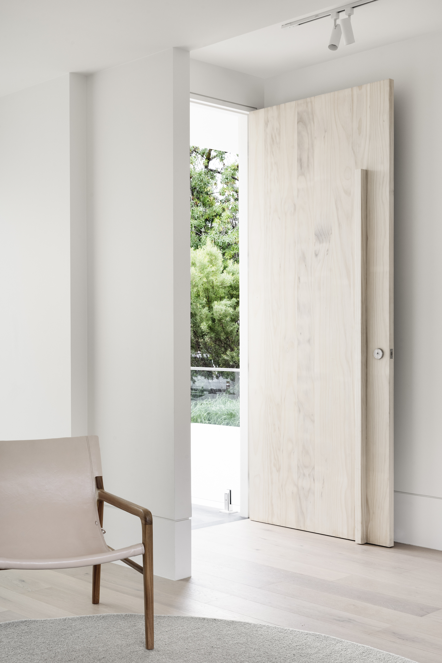
Indoor-outdoor living at its finest! Tell us about the goals with the pivot doors and amazing outdoor area (that pool is to die for).
The pivot doors are full of elegance and allow the indoor and outdoor space to merge seamlessly and is functional for any family who loves indoor/outdoor living and entertaining. The pool adds another layer to the calm and relaxing environment and is positioned to be enjoyed with a view from inside. The selected tile creates inviting water and a seamless feel adding to the sanctuary element of this home.
What are your Barnaby Lane picks?
Sticking to the gorgeous tones of tan and blush Barnaby Lane offers was key for this tonal home. Each piece seamlessly shined its own beauty without any competing heroes throughout the home. The selected pieces made you feel right at home and invited a sense of comfortable and functional living. Quality over quantity allowed the spaces to remain airy and minimalistic. My list of favourites could go on forever, but to narrow it down, I love the Jones and Boston dining chairs for their simplicity and the Smith for its laid back and stunning appearance.


